A good mobile app isn’t the one that tries to achieve the most. It is actually the best-designed one, allowing customers to navigate with ease, get their desired information quickly, and with really great aesthetics. Yet, some people mistake complexity for benefits. They end up clogging up the UI with a slew of unnecessary components making the user experience much less intuitive.
There is no need to be concerned. Help is at hand. You can connect with an experienced app development firm that takes your mobile app design to the next level by incorporating 10 vital yet frequently underrated features.
What features you ask? Read more to find out.
1. Ease of Use
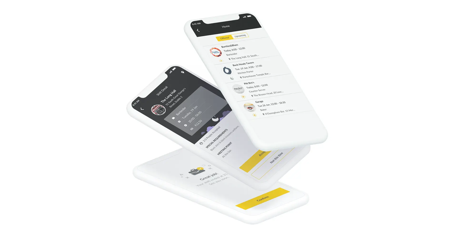
How can ‘being easy’ be a design-specific feature? Well, it is arguably the most important one. If you plan on creating a mobile app and UI designing has commenced, make sure the design is kept basic. By basic, we mean minimal experience-boosting elements, one single experience broken into multiple steps. It is important to be extremely direct with what you want a specific component, text-field, or button to do.
2. Predictability
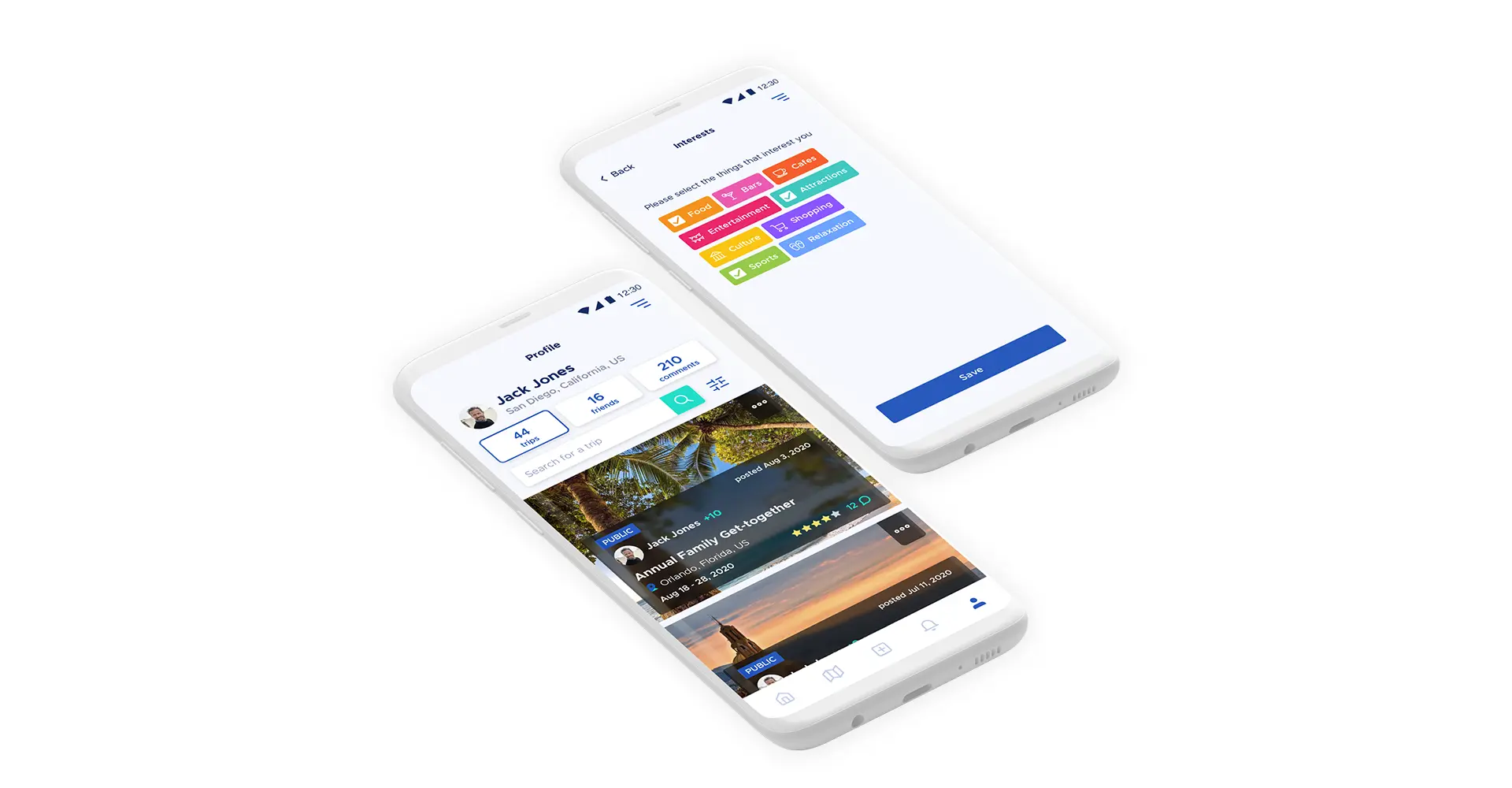
Being mysterious can be good sometimes but definitely not when you are designing an app. Make sure the navigations are straightforward and one screen of the app doesn’t take the customer to a completely unexpected feature. Just imagine how you would feel if entering the password on an app takes you unexpectedly to the checkout basket rather than the home screen or your user dashboard.
In simple terms, the app design should adhere to the ‘Three-Click’ rule. It suggests that a user should be able to find any information on an app with no more than 3 taps of the screen. While this may seem improbable, it is possible only with clever and user focused design.
3. Prioritize Usage
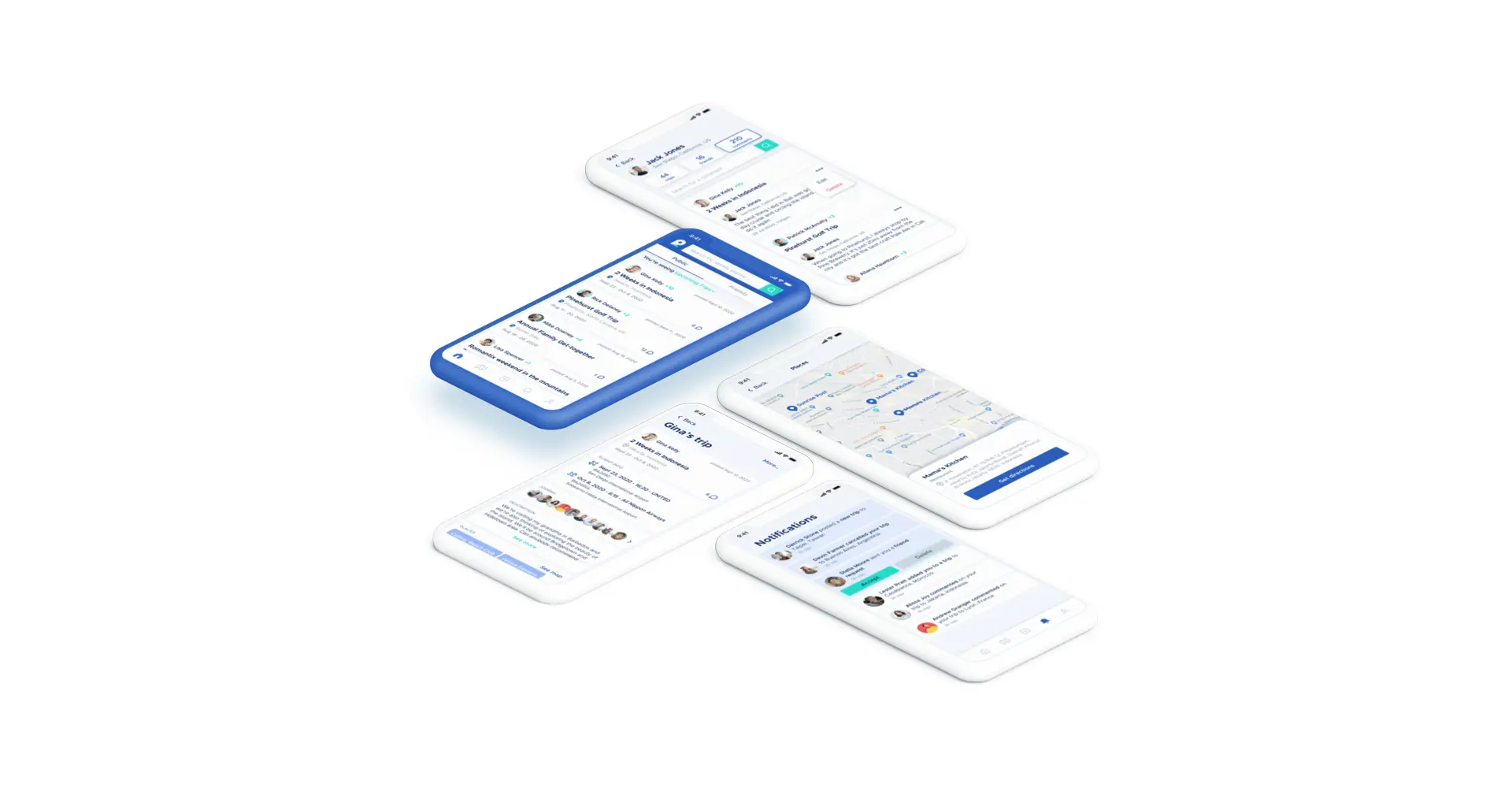
After ease and predictability, the next important thing is usability. A startup looking to get a killer app designed must feature important menu components up front, label all products on the page with certainty, and design the user flow as per the ‘Z’ pattern. The ‘Z pattern’ layout is all about tracing the route that the human eye travels when they read. The pattern resembles a Z – from top left to top right, diagonally from top right to bottom left, and lastly from bottom left to bottom right.
When using a visual interface or perusing a website, this is how we take in information. Hence, placing important components of your design along the same lines will help a lot in better UI.
4. Consistency
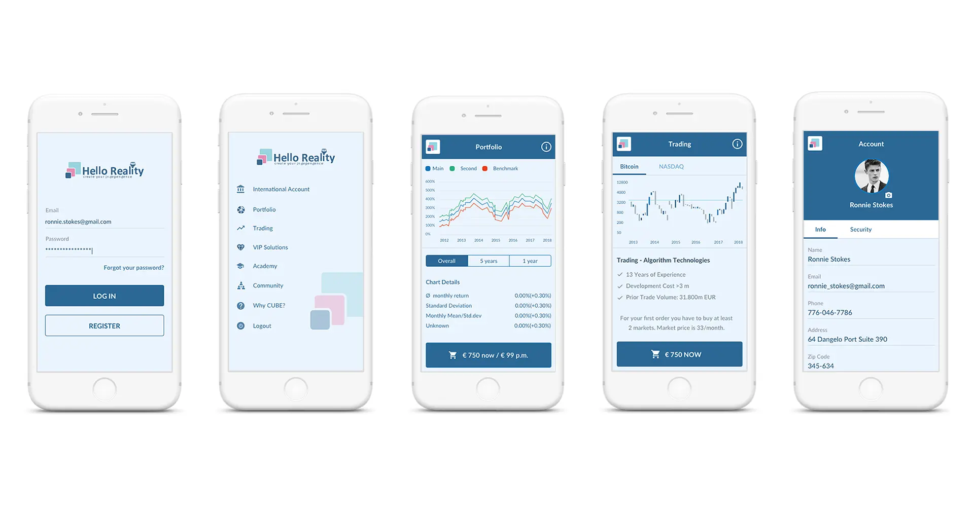
Ensure that the colors, fonts, and design dimensions you use are similar across all stages of the app’s UI. Messy layouts are hard to absorb for the human eye.
5. Cut the Clutter
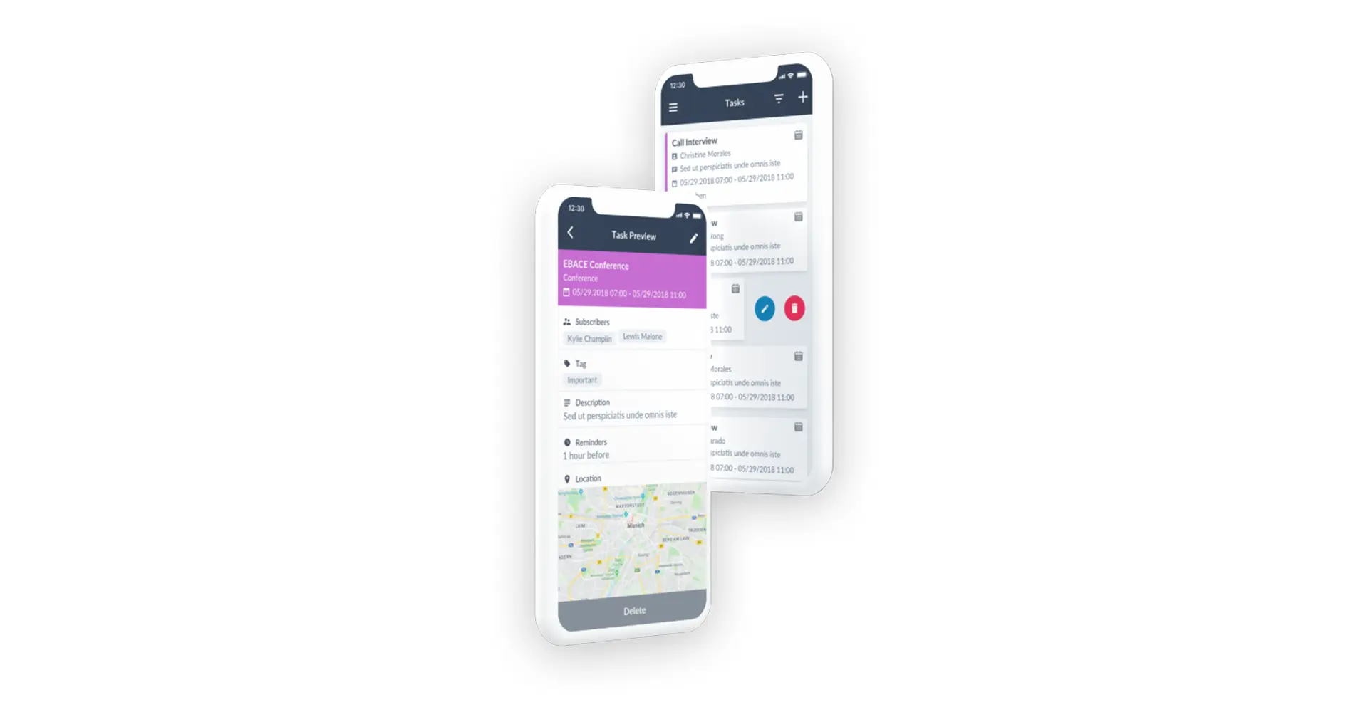
Even if your app UI doesn’t have any content, you can end up being too verbose by including too many things. Just a tip: only stick with elements that are absolutely important. Especially, if you are starting out and building your first app. Go by the rule “less is more.”
Some important points are to avoid complicated login processes, early registrations, and to definitely feature an inviting onboarding page.
6. Color Coherence
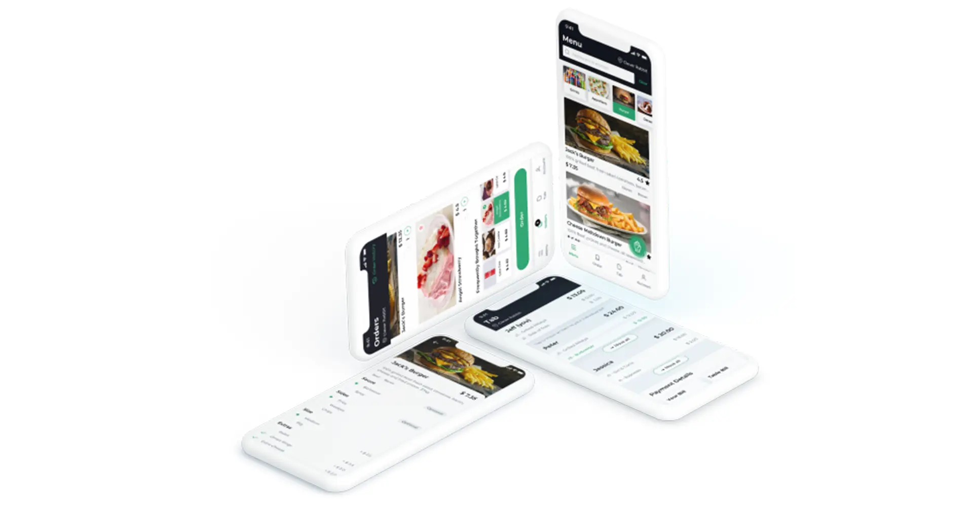
Yes, your app design will certainly have colors, Figma, Sketch and other tools can really visualize your concept accurately. However, before you get down to designing the app, make sure that the color tones, consistency, and even the warmth match the style of your app or even more importantly, the product.
7. Use Illustrations as your Ace
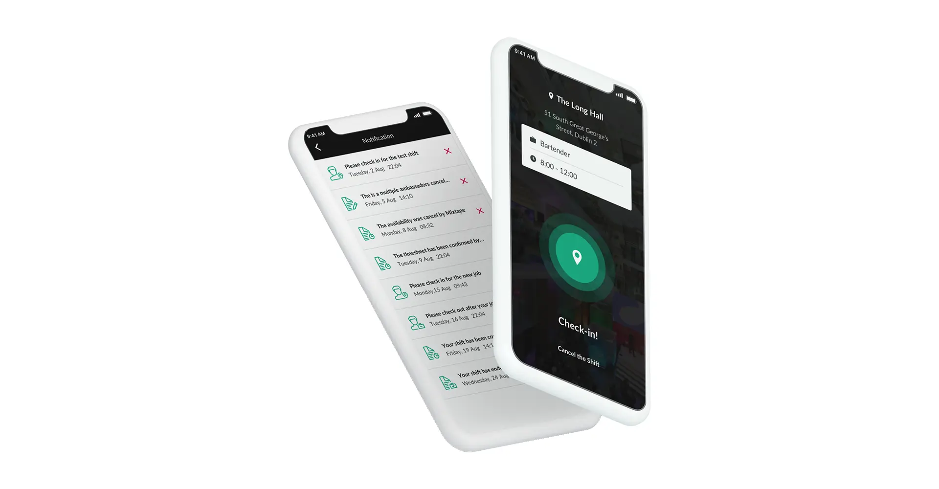
Every app design should plan for illustrations. But you should never use them at will. Instead, try to be smart with app illustrations - making them reiterate points that standard icons and texts might not be able to convey well.
8. Invisibility
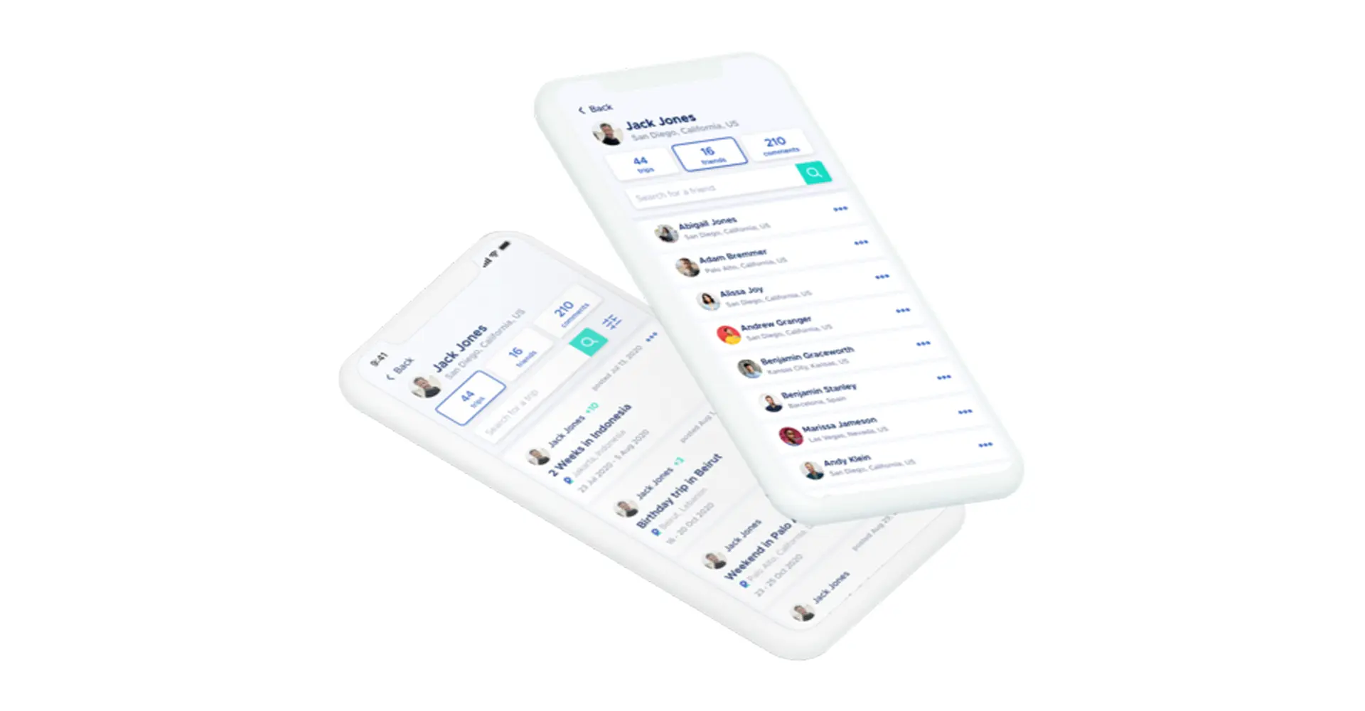
Make sure that the moment a user logs onto the app, he or she should hardly ever encounter a UI set in stone. This means you should try to make sure that the design UI is airy and exceptionally light so that the feature transitions do not even feel like hard work for the user.
9. Make the UI One-Handed
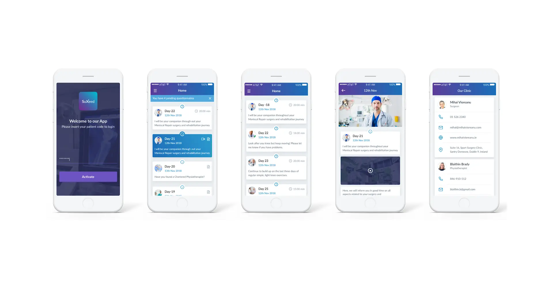
Here is a really important thing. If you plan on designing a mobile app, you need to make it work well for users who mostly operate using one hand. Therefore, it is important to place user controls correctly and opt for a top-level app menu. Negative actions like logging out should be placed closer to the hard-to-access zones.
10. Make the Design Look Fast
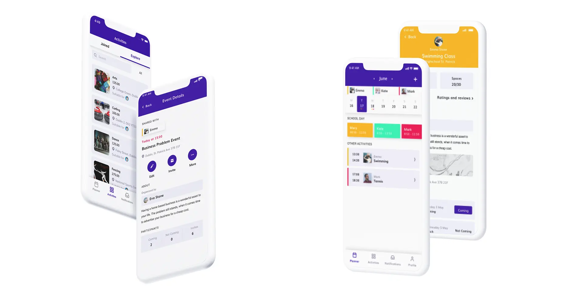
This is where the user perception comes into the mix. Before it even comes to the APIs, try and make the design interactive, especially by adding push notifications and refresh actions.
That’s it for now. If these features are a bit challenging to implement for your current in-house development team, you can always connect with Deventure to get your app designed to perfection, regardless of the platform you want it to cater to. We work well with client IT departments.
If you are on the lookout for website or app services for your organization, do contact us for a no-conditions attached free consultation session.


